

A Google Analytics dashboard should be your team’s command center for growth. But in 2026, most dashboards have become like the shelves of a grocery store the night before Thanksgiving—they are packed to the ceiling with ‘stuff,’ but finding the one ingredient you actually need is an overwhelming challenge.
In addition, many dashboards rely on fragmented UTMs and are focused on metrics rather than outcomes, which not only fails to provide insights but actually actively hides ROI.
The Modern Google Analytics Dashboard Guide (2026)
Turning messy campaign data into a narrative-driven ROI engine.
1. What Marketers Expect From a Google Analytics Dashboard Today
Google Analytics in Numbers
According to GA4.com, Google Analytics is the most widely used website analytics tool powering with data close to 44 million websites. With over 14 million of them using GA4, Google Analytics holds the largest share in the analytics market and is used by some of the top companies in the world, including Nike, AliExpress, Netflix, and Uber.
It is an amazing tool. Its platform offers a level of depth and event-based tracking that was previously impossible for the average business. However, that power comes with a cost: complexity.
The Real Marketing Need: Surfacing Insights with a Click
While GA4 is great for deep-dive data science, day-to-day marketers often need something simpler. They need a way to cut through the layers and see the ‘big picture’ without getting lost in multiple menus and reports.
They don’t just want more data; they want a less complex way to understand what is actually working and see the story behind the metrics.
They want a dashboard that works as hard as they do to find the next big opportunity and provides:
- Context.
- Clarity.
- A story.
- Without the need to spend hours and days digging for campaign data.
Instead of analyzing tables and building pivots, marketers need instant answers to questions like:
- Which campaign brought the most new users?
- Which campaign generated the most key conversions?
- Which channels are driving real engagement?
- Where should we increase budget?
This is where traditional GA4 analytics powered dashboards fall short.
They show raw data — but they don’t connect the dots and fail to provide a narrative that drives KPI understanding.
Instead of forcing teams to interpret rows of metrics manually, a modern dashboard should summarize what changed, what matters, and what to do next – in seconds, using AI.
A modern dashboard should take the relevant raw data and recalculate it into meaningful outcomes that relate to business objectives, leveraging the power of AI.
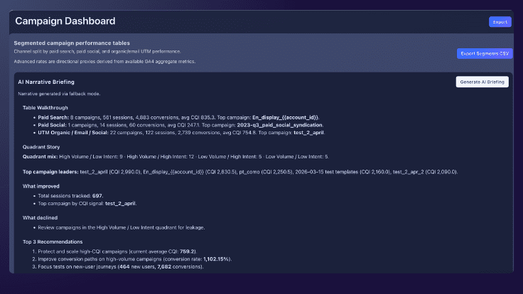
What to do: Start With a Narrative, Not a Chart
The first thing any stakeholder should see isn’t a graph — it’s a briefing.
A modern dashboard should immediately explain:
- What happened
- What changed
- What matters
- What to do next
This is where AI becomes essential.
Instead of letting users spend time to manually analyze reports, the dashboard should generate a clean narrative of the last month and compare it to previous performance.
“Paid Search delivered the highest campaign quality this month. Organic campaigns drove strong new user growth. Several high-volume campaigns showed lower intent and require optimization.”
This transforms reporting from:
❌ data → charts → manual analysis
into:
✅ insight → narrative → action
2. Moving from Volume Metrics to Intent
High traffic alone does not equal performance. A modern dashboard must distinguish between volume and intent.
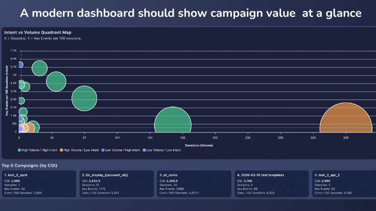
High-volume traffic is not always high-value traffic. An intent-vs-volume view helps marketers see which campaigns to scale, fix, or deprioritize.
A modern Google Analytics dashboard should make campaign performance visible instantly — without forcing marketers to dig through multiple views. It should help decision-makers see in seconds which campaign brought traffic and conversions, so that marketers can quickly assess which initiatives to keep and which – to optimize or replace.
This is where the Intent vs. Volume Quadrant becomes critical
The Intent vs. Volume Quadrant is a strategic visualization that plots your campaigns based on how much traffic they drive versus the actual quality of that traffic.
We use it to instantly separate high-performing “Scale Winners” from low-intent “Slipped” campaigns, ensuring you stop wasting budget on noise and start doubling down on ROI.
What to Do: Build an Intent vs. Volume quadrant
Instantly Rank campaigns in your GA4 Analytics Dashboard based on actual performance
High Volume / High Intent
→ Increase budget, get higher ROI at scale.
High Volume / Low Intent
→ Fix leakage: understand what doesn’t work – targeting, UI, or messaging.
Low Volume / High Intent
→ Scale strategically: leverage your niche winners to drive differentiated value.
Low Volume / Low Intent
→ Deprioritize: stop investing in campaigns that bring low-value traffic.
Instead of guessing which campaigns matter, marketers can now see in seconds where their ROI is with the help of a well-crafted Google Analytics powered dashboard that hilights key analysis points and makes it easy to draw conclusions.
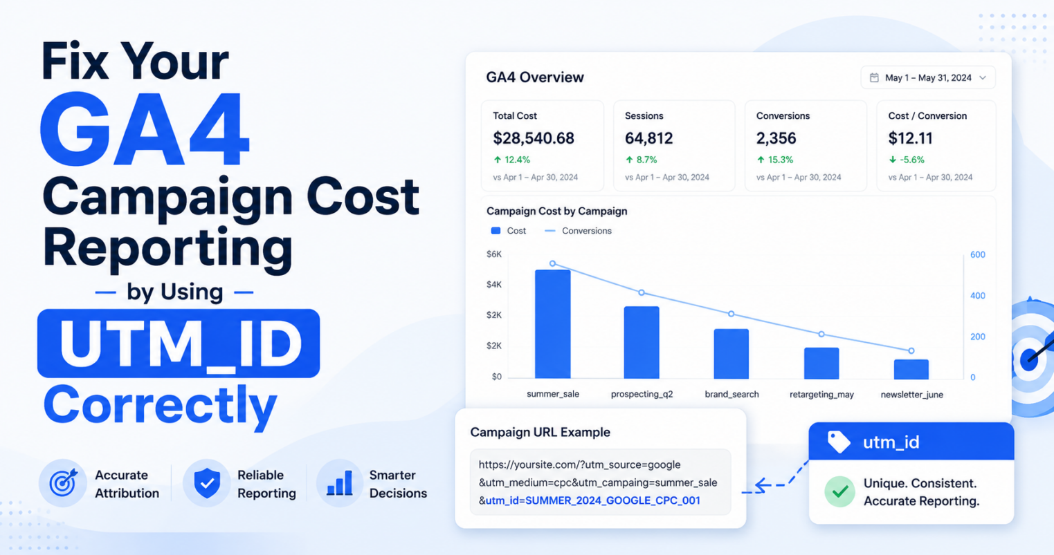
3. The Campaign Quality Index (CQI)
GA4 gives you extensive data and access to deep analytics opportunities.
Google Analytics features in a nutshell
- Hundreds of built in dimensions and metrics
- Extensive filtering based on data, reports and comparisons
- User, event, and custom dimensions types that can be sliced and diced by 200 explorations, and more…
Why CQI is Key for Google Analytics Powered Dashboards
While Google Analytics features incredible depth, it often comes with a steep learning curve. In the meantime, what marketers truly need is a simplified approach.
Instead of getting lost in the data, they need a simple “story” that instantly surfaces which campaigns are creating the most value and which ones need immediate work.
This is exactly where the Campaign Quality Index (CQI) changes the game.
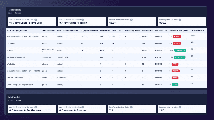
An effective Google Analytics dashboard should connect campaign names, source data, engagement, new users, and key events in one view.
What to Do: Introduce a CQI model
enable your Google Analytics dashboard to compare campaigns in a standardized way
The Campaign Quality Index (CQI) serves as a universal translator for marketing performance, distilling complex engagement and conversion data into a single, weighted score that makes “apples-to-oranges” comparisons across channels finally possible.
Why You Need a CQI
By unifying fragmented metrics from every stage of the customer journey, CQI allows you to instantly see whether a high-volume TikTok video or a low-traffic email is delivering the highest true value to your bottom line.
The CampaignTrackly CQI
The Campaign Quality Index (CQI) developed by CampaignTrackly, for instance, combines engagement, behavior, and key events into a single performance score to enable marketers to compare apples to apples and make informed decisions.
This allows you to compare completely different channels on the same scale.
- For example, the CQI approach lets you see instantly that in the table below, Email is your most valuable channel because it has both a high CQI score and the highest number of average key events per user.
| Channel Segment | Average Key Events / User | CQI Score |
|---|---|---|
| Paid Search | 11.5 | 835.3 |
| UTM Organic / Email | 63.7 | 754.8 |
| Paid Social | 4.3 | 247.1 |
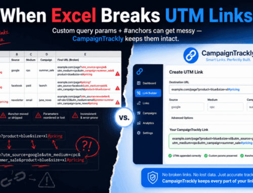
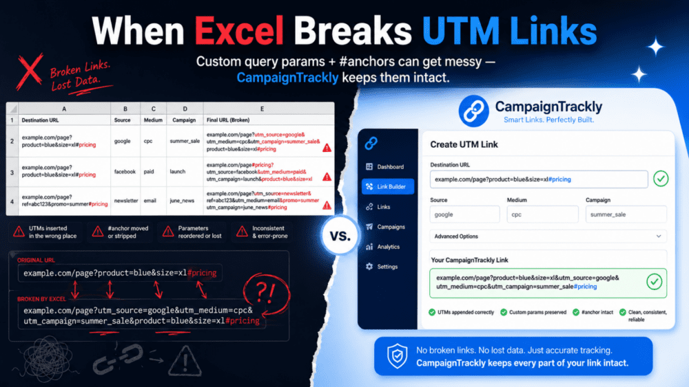
4. The “Dirty Data” Reality Check
One of the main stumbling blocks in reporting is data quality. Your dashboard is only as good as your campaign tracking.
If your team is:
- Typing UTMs manually
- Using inconsistent naming
- Managing links in spreadsheets
Then your Google Analytics Powered dashboard will show:
- Unassigned traffic
- Duplicate campaigns
- Misleading performance
This isn’t a dashboard problem.
It’s a data problem. And it needs to be solved through standardized marketing taxonomies, campaign naming conventions, and optimized business processes.
What to Do: Fix Your Data Problem
A modern dashboard only works if the data feeding it is accurate and structured correctly.
This is where tools like CampaignTrackly help marketing teams solve reporting roadblocks by standardizing automatically campaign name governance and digital tracking link consistency, while powering up productivity and saving time. What we offer:
- Standardized campaign URL builder
- Consistent UTM naming
- Clean GA4 inputs
- Reliable UTM_campaign reporting outputs
- A 90-second GA4 data health analyzer and a Powerful Modern GA4 Analytics Dashboard.
- Integrations with your favorite tools.
Fix the inputs → and the insights become Better, Cleaner, More Reliable.
Frequently Asked Questions
What is a Google Analytics dashboard?
A Google Analytics dashboard is a visual interface that displays key metrics like traffic, conversions, and campaign performance in GA4.
Why are GA4 dashboards hard to use?
Most GA4 dashboards rely on raw data and require manual analysis, making it difficult to extract actionable insights.
How can I improve my GA4 dashboard?
Improve your dashboard by standardizing UTM tracking, using structured campaign naming, and adding insight layers such as AI-generated summaries.
What is the biggest problem with GA4 reporting?
The biggest issue is inconsistent campaign tracking, which leads to inaccurate attribution and misleading reports.
Can I try your Google Analytics dashboard?
Yes, just create a free CampaignTrackly trial, connect with your GA4 account with a click, and head over to Reports to see your results in seconds. You can also use our 90-second UTM Analyzer to see what you are doing great and what can be improved.
Is Your UTM Tracking Safe?
Watch the 40-second video to see how to prevent UTM errors that hide your hard-earned results.


