

In this blog, I will cover a few tips and tricks that can easily solve some styling issues related to using the Marketo forms capability, as follows:
- Hiding the asterisk from the “required” fields.
- Placing the label of a checkbox on the right-hand side.
- Bolding only certain words in a Field label.
- Fixing non-responsive text snippets (mobile browser view)
Saving Time with Marketo Forms
Building a complex Marketo form takes minutes and that is why this platform is so great – it lets you save so much time while creating reliable marketing assets that can provide excellend user experience.
The Forms functionality offers a lot of advanced features, such as conditional hidden fields, conditional “thank you” pages, the option to provide different experience for users that are already customers or known leads, and so much more.
In this blog post, I will cover some of the forms’ styling workarounds that are surprisingly easy to implement, but at the same time, hard to uncover. If it is not for someone to show you or tell you, chances are you would not even know that these exist to make your life so much easier.
1. Hiding the asterisk.
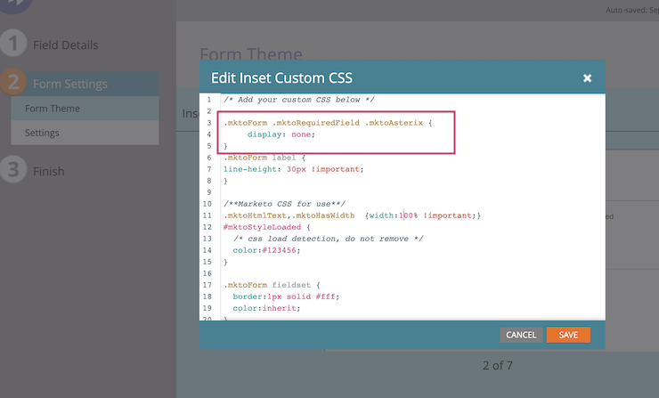
This is one of the easiest tasks to do and one that is really hard to remember, so here you go – if you ever want to hide the annoyng “required field” asterisk, just add this code to the custom CSS of the form or on your landing page. The custom CSS is located under the non-editable theme CSS of the form available in the Form Theme tab.
Your Custom CSS is editable and will be empty when you open it. Feel free to place this code, save your form and preview it to see the asterisk gone. Here is the code to use:
.mktoForm .mktoRequiredField .mktoAsterix {
display: none;
}
2. Placing the label to the right of the checkbox
This one was a bummer. When this styling requirement came, I admit I tried several CSS workarounds before finding our that I can actually use the neat “checkboxES” field, instead of the singular checkbox field to action this.
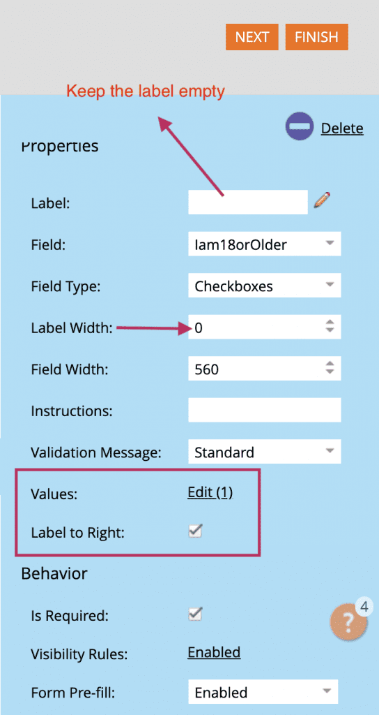
This is such a quick and elegant solution, and it also carries a great bonus, which I will share a bit further down below. But first let’s say, you need to add a checkbox field “I am 18 years old or older” (yes/no). And the requirement is that the label is placed to the right of your checkbox.
This is what you need to do to accomplish this – see the image below:
- Use the “Checkboxes” field type. Why? You can potentially use the single checkbox type, hide the label and add a text snippet to the right of it, however that would result in issues in Mobile view and most importantly, you won’t be able to custom-style your label.
- Keep the label empty
- Setup label width at 0
- Keep the field with wide enough to hold the text for your right-aligned label
- Select “Label to the Right”: True
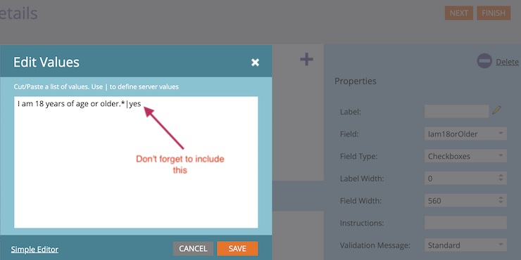
- Click to Open values and enter your “I am 18 years…” text in it.
NOTE: Once you open the “Edit Values” popup, make sure that you enter “| yes” after your text, as in the image below:
And here is your unexpected bonus – if, for any reason you need to custom-style the text – like make it bold, or add a custom color, you can actually use HTML inside the box and it will work for you!!
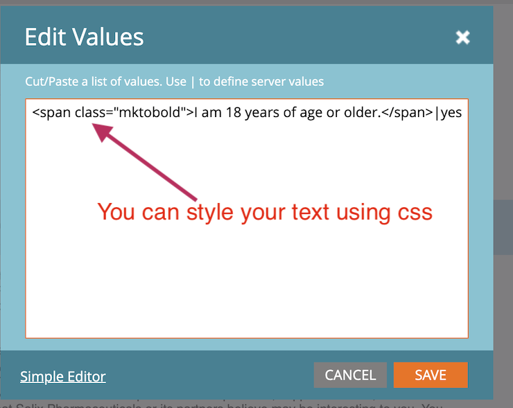
3. Bolding only certain words in a Field label.
This one is super easy, and will require that you use the custom CSS again. Add the following CSS rule(s) in it, depending on whether you need only bolded or both bolded and italicized styling:
span.mktobold {font-weight: 700!important; }
span.mktobolditalic {font-weight: 700!important; font-style: italic!important;}
Then go back to your form, click on your label to edit it, select the HTML edit version and use this HTML code:
<span class=”mktobold”>Enter your text here</span>
And you are ready to go. Easy-peasy.
4. Fixing text snippets that break the form’s look and feel in mobile browsers.
If you have a form, where you have to add a text snippet to the right of your your form field with a margin of more than 200px, sometimes, you might get an unexpected surprise when testing your form across Mobile browsers. The text snippet might misbehave and you will have a bit of an ugly form:).
Why would you need to add a text field, and at such great margin at that? Well, let’s say you have to put a special ID number or PRC approval number and the styling dictates that this number has to stay to the right and separated from the field against which it has to be positioned.
When that happens, remember that you can use your Custom CSS and add a few simple rules to address this issue with this styling:
§§§§§§
/*create a div for the text and use it to position the text away from its adjacent form field – that enables you to easily edit the margin at will with a few clicks
#prcnumber {
margin-left:270px;
text-align: right;
}
/*add a rule for monitor size smaller than 480px (it can be any width that you need) by removing the margin and specifying the width to be 100%, which will force the text to reside on a separate line
@media only screen and (max-width: 480px), only screen and (max-device-width: 480px), only screen and (max-device-height: 480px){
#prcnumber {width:100%!important; margin-left:0px;}
}
§§§§§§
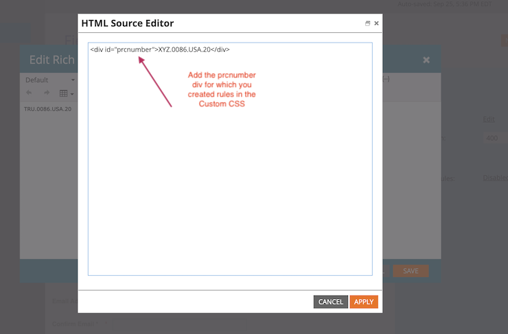
Once you have saved your custom CSS, create your rich text snippet. Populate the required ID or text and edit it in HTML to be able to add to it the “prcnumber” div id in the following way:
<div id=”prcnumber”>XYZ.209.17.20</div>
And you are all set. The “div” styling that you defined in the custom CSS will make sure that your rich text snippet is behaving well when viewed on a mobile browser.
Hope these quick tips have been useful.
This blog is about: Marketo, Marketo forms, Styling, Custom CSS, Responsive Forms


